Palettes to Spark Creativity
Interior Design Colour Predictions for 2015
Every day we interact with colour and see how it takes shape in design, fashion, modern art and architecture. Homeowners and designers have their fingers on the pulse when it comes to what trends are in store for the New Year and what colours are the ‘in’ things to have in our homes.
As we slowly move away from the interior design trends that dominated 2014, an obvious shift is seen in the colour direction as softer palettes boom significantly. For 2015, the colour trends are all about creating a vibrant drama that is flexible and illustrated, bringing together a ‘feel good’ ambiance in a space. You’ll be reminded of the retro era, complete with a balance of lush greens and dusty clays that bring us back in touch with nature. Here are the top five colour predictions for 2015.
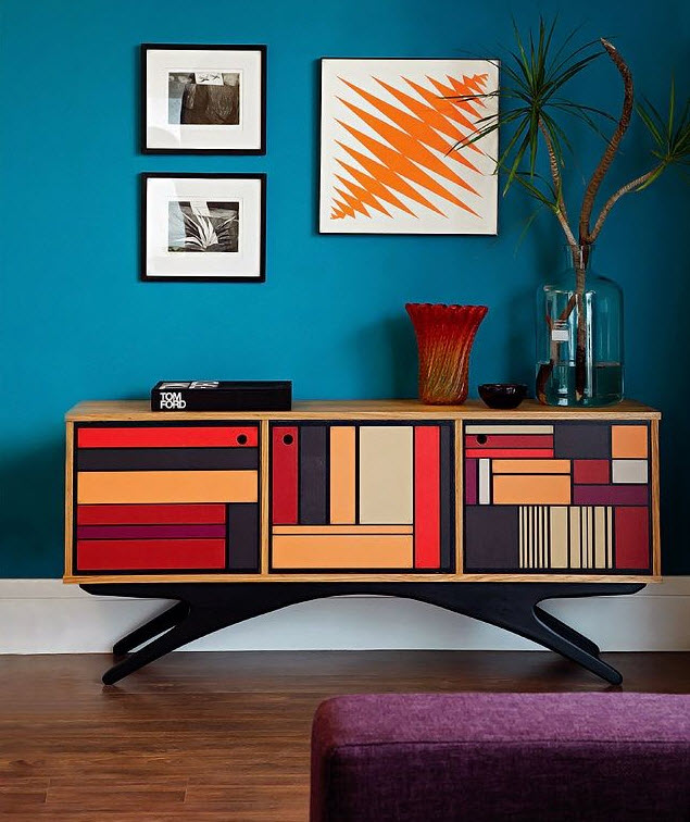
Image: Nicety Livejournal
1. The 4 Colours Predictions from Dulux
Dulux have created four colour palettes grounded by their colour predictions for the New Year. To establish these tones – Wildland, Earthwerks, Modhaus and Silentshift – Dulux have carefully collaborated with a handful of design and textile professionals to bring these colours to life for 2015 and beyond.
Featuring colours that “reflect untamed landscape”, Wildland is driven from the need to connect with the environment and bounces through a contrast of light and dark tints. It’s a comfortable palette and features colours like ash blues, soft golds and misty greys. In the same environmentally motivated touch, the Earthwerks palette draws from greens and mineral hues encouraging homeowners to get their “hands dirty and create things from scratch”.
On the other scale of the scale, Modhaus explores an element of curiosity and boldness. The colours – from vibrant blues to burnt oranges – represent colour trends from the 1980’s with a retro funk. Silentshift takes a similar outlook on these tints but softens them into a dreamlike quality. The colours in this palette take on a pastel feel, with a restful mix of calming blues and salmon greys. You can check out the full range of colours in Dulux’s palettes here.
2. Raw and Rustic Shades
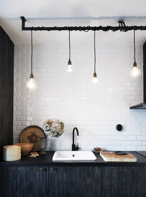
Image: TrendLand
According to Haymes Paint colour forecast for 2015, raw and rustic shades will establish a sense of versatility in your space. Connecting the old with fresh, the colour palette is made up of organic shades of grey and crème and warm browns. In a fascinating blend of traditional materials, these raw shades work well industrial metal, gilded antiques and carved wood accents to truly show of its natural appeal.
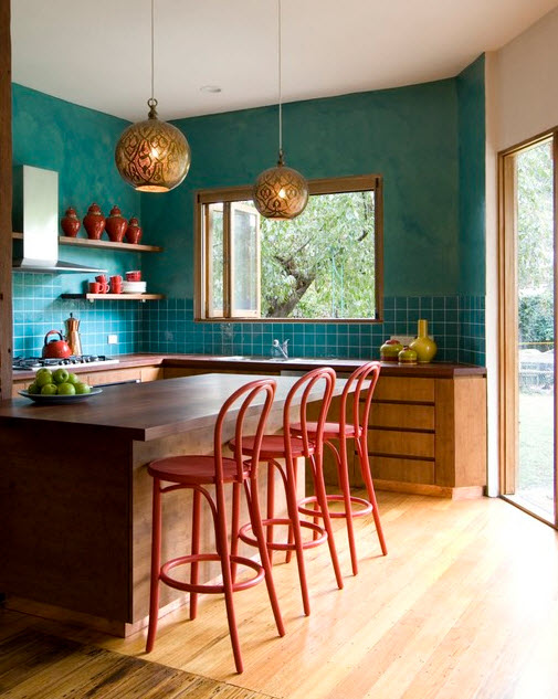
Image: Camilla Molders Design
Haymes Paint colour palettes have a desire to create a journey by reconnecting you with the elements in your surroundings, heightening all senses. The raw and rustic shades from the greyish blue colour in a faded pair of jeans, right through to the soft crèmes and browns defines a fusion of styles to create a comfortable and interesting living space.
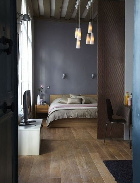
Image: All Things Elegant
3. Soft Pastels with Shades of Grey
If you haven’t already discovered the magic of mixing pastels with shades of grey, then 2015 is the year to experiment with this striking combination. In a natural-looking room, soft pastels can be perfectly set off with shades of grey or creamy white tones. The contrasts of the colours are balanced in contemporary spaces to create a relaxing effect. Because pastels are tints closest to white on the colour wheel, colour combinations with creamy whites can be implemented throughout the home without looking too ‘loud’.
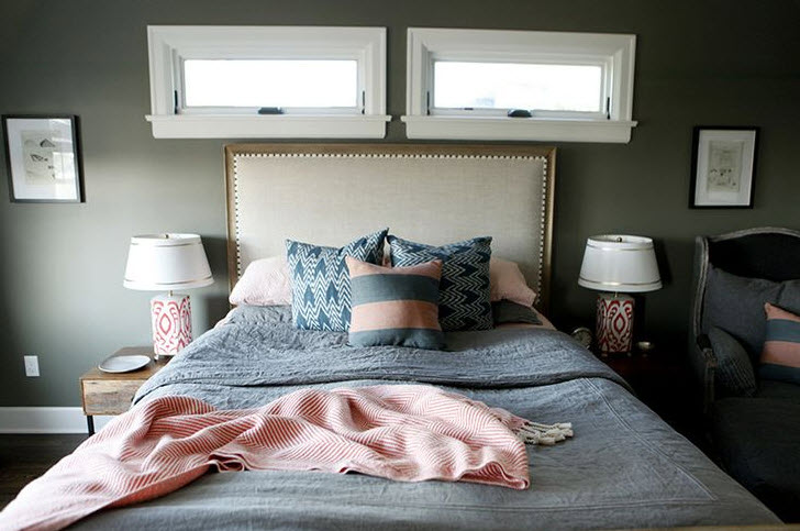
Image: L’essenziale
New to the pastel decoration scheme? One of the best places to experiment with pastels is in the kitchen by creating a space that is bright and welcoming for family and friends. Use smaller amounts of these “milky” colours; for example, paint only the chairs and opt for pastel cooking equipment. By incorporating shades of grey into the space too, you can make the colours pop. If you’re a little more daring, bring pastels into the bedroom with a solid wall of grey to ensure there’s a more masculine feel to the space as well.

Image: Decor8
Rule of thumb with pastels is to keep the details to a minimum. If you’re using grey to balance out the flavours in the space, this article provides some great information about the 50 shades of grey and its split personality to watch out for when decorating.
4. Exotic Botanic and Organic Design
Bringing natural themes into modern interior design has been a growing trend for years now. As homeowners begin to blur the line between the indoors and outdoors, fresh shades of green and organic designs have started finding a new home inside. As this trend develops, finding balance between these two complex worlds has never been so important.

Image: Camilla Molders Design
Natural materials, like carved wood and stone are complemented with light beige, dark charcoals and exaggerated patterns that ooze rich jungle colours. The palette incorporates a blend of colours that are soft, earthy and light. Infused with tones like copper, golds and bronze, these colours are authentic and bring us back to life and decorating in a simplified way.
5. Eclectic Impulse

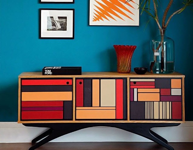
Celebrating a desire for adventure and lighting a spark of creativity like no other, this colour scheme is a proactive mix of things that don’t match! By invoking a sense of vibrancy and happiness, fresh combinations are joined with retro styles that hold no limits. Whilst the design is by no means versatile, it allows for the unconventional with energised colours that create a different dynamic to the space. Pooled with bold patterns and shapes and accessorised in front of a white, wood or grey backdrop, these colours allow for homeowners to connect with another world of interior design, on another level.

Image: Trend Hunter
Well, what can I say? I am glad my intuition made me take some pretty good decisions when it came to painting my home. Yes, my palettes are probably outdated now, but I still followed some of the rules!
colour palettes, interior design


